Friday, 6 February 2015

Draft Magazine


Overall, I'm fairly happy with my draft work and I would like my actual magazine to look like this. However, I think that one major improvement that could be made is the image I used for the front cover. For some reason, that I can't put my finger on, it just doesn't look like it follows the same design principles as the other images that are present on my draft. The model's skin would also need to be improved with airbrushing or make-up for the real cover. For my real magazine I also need to take my own photos for the contents page as the ones used in my draft are just placeholders. However, they are similar to photos I plan to take. 

The Japanese typography utilised within my draft serves both a practical and a stylistic purpose. Practically, the Japanese typography serves the role of translating major headings and info into Japanese for Japanese readers. This is necessary as I intend for my magazine to be an international magazine, which is to be published in London and Tokyo. However the Japanese also serves a stylistic function as it makes my magazine look professional, cultured and stylish. The synergy of English and Japanese within my draft takes inspiration from Anglo-Japanese magazines such as Popeye which are published in Japanese and English. 

When it came to the design of my draft I took inspiration from magazines like Vice, Surface 
and i-D. All these magazines follow a minimalistic and bold approach when it comes to designing their products which I really like. However the biggest influence on my work was probably American Apparel adverts. They follow a really professional/neat looking design philosophy which I tried my best to emulate within my own work. American Apparel adverts also implement the font 'Ariel Bold' throughout their products, which inspired me to do the same as I think Ariel Bold is the best looking font out there.

Other improvements that I need to make are the sizes of the pages as they're not uniform. I also need to write my article for the double page spread as the one currently used by my draft is just a placeholder that consists of gibberish. It also looks a tad plain in just b&w, so I might experiment with colour in future versions. 


Wednesday, 4 February 2015

Planning: Draft Magazine Photos

The Photoshoot


For the draft magazine photoshoot I used an SLR Nikon D3200 to take pictures of my model. This provided far superior quality pictures compared to the Fuji FinePix S1500 that I used for my preliminary magazine. The set up was the same as my preliminary shoot; it consisted of a white screen that was illuminated by three photography lights placed equidistantly around it. These lights were adjusted to be level with the model so his face was evenly lit. Below is a screenshot of some of the photos I took:


Chosen photos for the Front Page and Double Page Spread


Throughout the shoot I took 156 photos, most of them were okay but only a few turned out the way I wanted them to. I decided that my model looked best when he had his hair up in a mun (man bun) as this fitted well with the style and fashion that I want to implement within my magazine. The photo's I've chosen are also well framed, with the model being roughly centre. The poses that he pulls also varies which makes the photos look unique and interesting.

Editing Photos 


Because my magazine is going to be in black and white, I needed to alter the photos accordingly. This was done by using photoshop to convert the images into black and white. However, it wasn't that simple. I also used photoshop to alter the lighting levels, brightness and contrast in order to make the photos look crisper and sharper. Below is a step by step process of how I edited my chosen photos to make them look the part:


 Step One: First I had to rasterise the layer in which my photo was placed, in order to access the image adjustment tools (such as hue/saturation, brightness etc..)


Step Two: After I rasterised the layer which contained my photo/s, I went straight to the image adjustment tools and selected the 'Black & White...' function


Step Three: After the photo was converted to black and white, I then went to the 'Brightness/Contrast...' function and proceeded to alter the image to make it look sharper, crisper and more vibrant 


The End Result


Sunday, 1 February 2015

Research: Magazine Design Inspiration

Simplicity and Minimalism

When it comes to magazine covers I really like minimalistic designs that are simple but sophisticated. These kinds of covers typically have very bold typography with very little text as not to detract from the images on the magazine. Great examples of this are magazines like i-D, Surface, Vice, Dummy and The Wire. With minimalistic magazine covers it's imperative that the text has clean and crisp font and that all the elements on the page are well aligned with one another to create good page harmony. Great typography is also another crucial aspect. Although it may not be a magazine, American Apparel ads are a good example of simplistic yet effective page designs, which in my opinion look much better than the cluttered approach which indie rock magazines like NME typically opt for. A key aspect of minimalistic overs is that there is only a small amount of text.

American Apparel Ads 


As you can see, American Apparel ads typically have very bold and large titles/headers that draw the readers attention to them. and when this is coupled with a crisp font like Ariel, the results are impressive despite its simplistic nature. Another feature of these ads is that the elements of the page are perfectly aligned with one another creating a seamless finish that looks professional and slick. There's just the right amount of text on each ad, which places a good amount of emphasis on the photos as opposed to the text. Another important aspect of their design philosophy is the uniformity that can be observed. They only use 2 or 3 different text sizes which makes the ads look well thought out and tidy. 


However, a perfect photo is just as important as the typography of a cover when it comes to the overall aesthetic. To pull of a minimalistic style the cover photo has to be bold and eye catching.  Otherwise it will look boring. Here are some examples of covers that utilise almost zero text but still look aesthetically pleasing due to good photography/editing.

Monday, 26 January 2015

What we did today - Flat Plans

Double Page Spread - Layouts

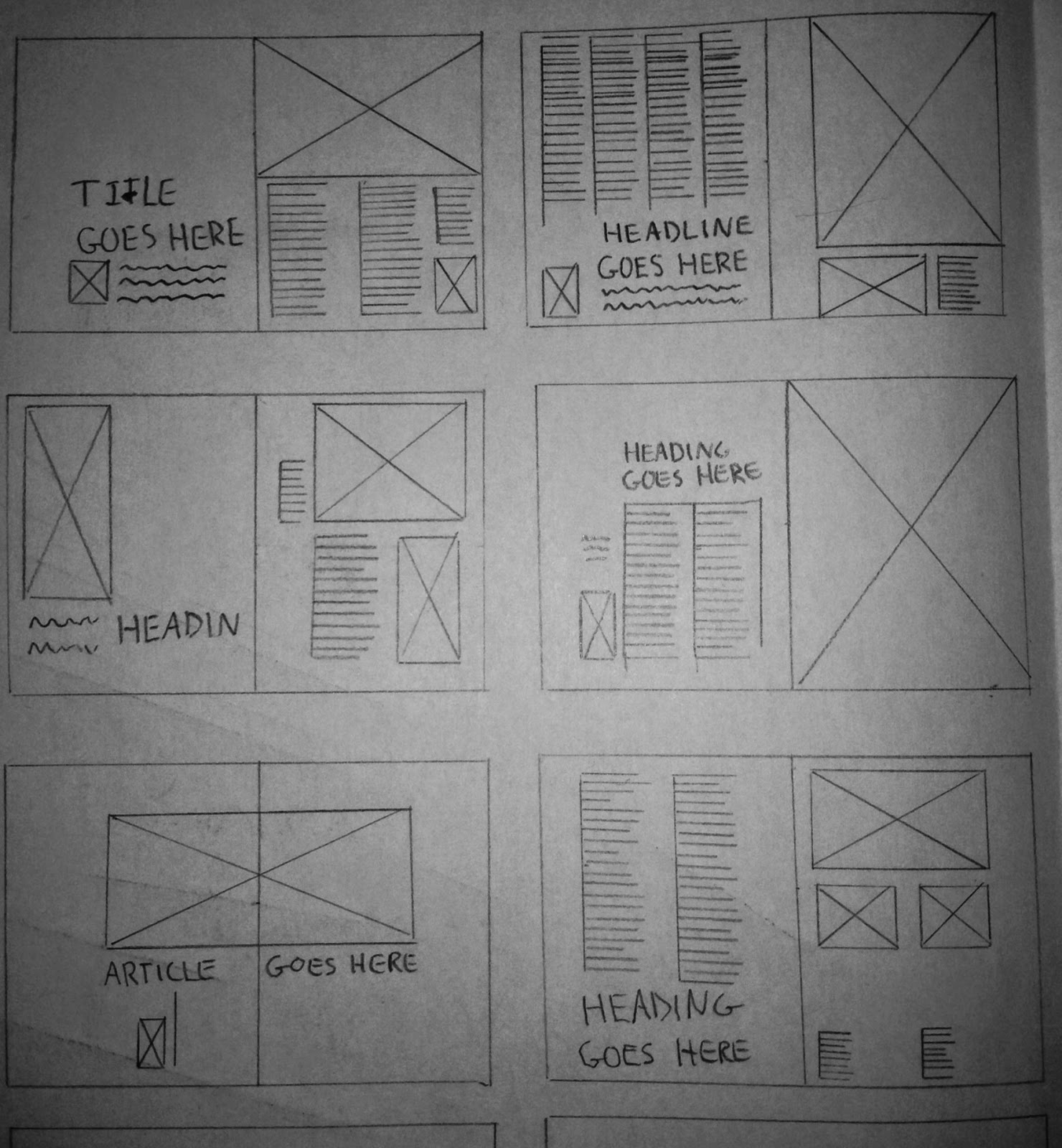
Today we created page layouts for our magazines. This was necessary so we have a basic idea of how to set out double page spreads when it comes to creating our draft magazines. Below are 12 different layouts for a double page spread that I drew free hand - the big boxes with the crosses represent images and the lines represent text. 


Sunday, 25 January 2015

Research: Institution that would publish my magazine

Vice Media, Inc. 

Vice Media, Inc, better known as just 'Vice', is a youth media company and digital content creation studio. It owns and publishes magazines such as Vice and i-D. It is famous for its strong ties with youth culture and the alternative scene which make it the perfect institution to publish my magazine as Oscillate is aimed 16-25 year olds and the alt crowd. 

Vice was founded in 1994 by Shane Smith and Gavin Mclnnes and now runs a network of digital channels across the globe. This network covers everything from world news to fashion and to music. Vice currently operates a music channel called 'Noisey' which caters to the alt scene and provides a platform for artists to express their creative freedom. However unlike i-D it is not in magazine form. my magazine would be the Noisey equivalent of a vice music magazine. 


Audience Research

UK tribes


According the research that I conducted on UK tribes, 'hipsters' are a social group which would be drawn to my magazine as they are apparently 'epitomised by vice magazine', which my magazine draws inspiration from. Due to similarity between the fashion implemented by my magazine and magazines like i-D, this also means that there are similarities in our magazines audiences.

"Like the 60s Mods and Rockers and the 70s Punks, Hipsters are as ubiquitous as Chavs in their role defining UK youth culture in the 2000s...

Epitomised by Vice magazine, rampant trend-chasing and getting absolutely wasted, Hipsters are increasingly the most detested Tribe in the UK. Most likely to be used as a term of derision, Hipster is associated with lacking substance, arrogance, being unoriginal – and more often than not, with being a white middle-class uni student. Calling someone a Hipster may now be a mockery, but whichever way you cut it, the ‘Hipster look’ has definitely come to dominate the high street.

The Hipster look draws from punk rock and the 90s with a splatting of bygone subcultures for inspiration. From Soviet prison culture to Grunge, the Beatniks or ‘white trash’ chic – these disparate influences mean the Hipsters have driven millennial youth fashion trends more than any other Tribe. From skinny jeans to the vintage/retro revolution, acid bright colours to animal prints, Aztec print and dip-dye hair – Urban Outfitters brings off-the-shelf Hipster living to the Trendies. Hipsters popularised fixie bikes, grandma specs, made Lomography and Holga cameras a regular on teen Christmas lists – Red Stripe became the summer drink of choice, Ketamine the drug, and minimal tech the sound.

With so much influence, what’s our problem with these kids? Christian Lorentzen writes that Hipsters ‘fetishize the authentic and regurgitate it with a winking inauthenticity’ and this arrogance and try-hard nature really gets up the back of a generation proud of ‘keeping it real’. Hipsters’ break-neck turnover through fads (and huge spending power to support it) mean they are seen as lacking substance in real meaning by older Tribes, while younger teens recreate their super cool look and lifestyle in Claire’s Accessories. Is it fair for Hipsters to get such a bashing, while the close-by Trendies get by without a scratch?"

YOU GOV


The audience for my media product based on audience research would be hipsters and young alts aged from 18 - 25. According to audience research conducted on YouGov UK, the type of person typically interested in alt artists such as FKA twigs and King Krule are male aged 18 - 24, live in London and are interested in art, culture and fashion. For this reason my magazine fits this target audience perfectly as my magazine adopts a graphological and fashion style that’s popular amongst that scene. I also previously stated in my research and planning that I wished for my magazine to be published in London and Tokyo primarily, so this works well seeing as my target audience primarily live in London.